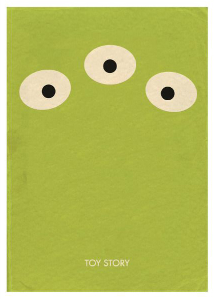
 Minimalist design is a creative and highly innovative art form of the 20th century and 21st century. The best designs are the ones that convey optimum message through minimum design elements. This is because most viewers have limited power of the understanding of the information revealed to them. The task of saying more with less proves the creativity and ability of a graphic designer. This particular poster displays three eyes over a green background. To me, this advertises very well, especially with the use of colour contrast. Also incorporating humour the poster is very important considering the topic is somewhat humorous to begin with.
Monthly Archives: June 2017
‘Rocky’ Minimalist Poster – Matt Owen

This is another example of minimalism where people who may have already seen the movie will instantly interpret the two lead characters . The poster displays the iconic images of the two boxing shorts both fighters Rocky Balboa and Apollo Creed wear in the movie.
Bombs Away (Reality TV) – Peter Kuper

This is an example of simple composition yet it gets its point across effectively. The poster displays an image of a a television and on the screen you can see the use of figure ground theory. The mind interprets both the image of two planes bombing a building but also interprets the image of what looks like a skull. Skulls and skeletons are linked to death and destruction.
War = Death – Michael Mabry
 The graphic designer and illustrator has dedicated his career to creating visual images that challenge the mind and touch the heart. I believe this is a simple composition but gets it’s point across effectively. The message reads ‘War = Death’, but what makes this interesting to me is the use of the skull and figure ground theory. The mind interprets both the message and the skull image. Skull and skeletons are linked to both death and destruction.
